
Performance, Properly Scaled.
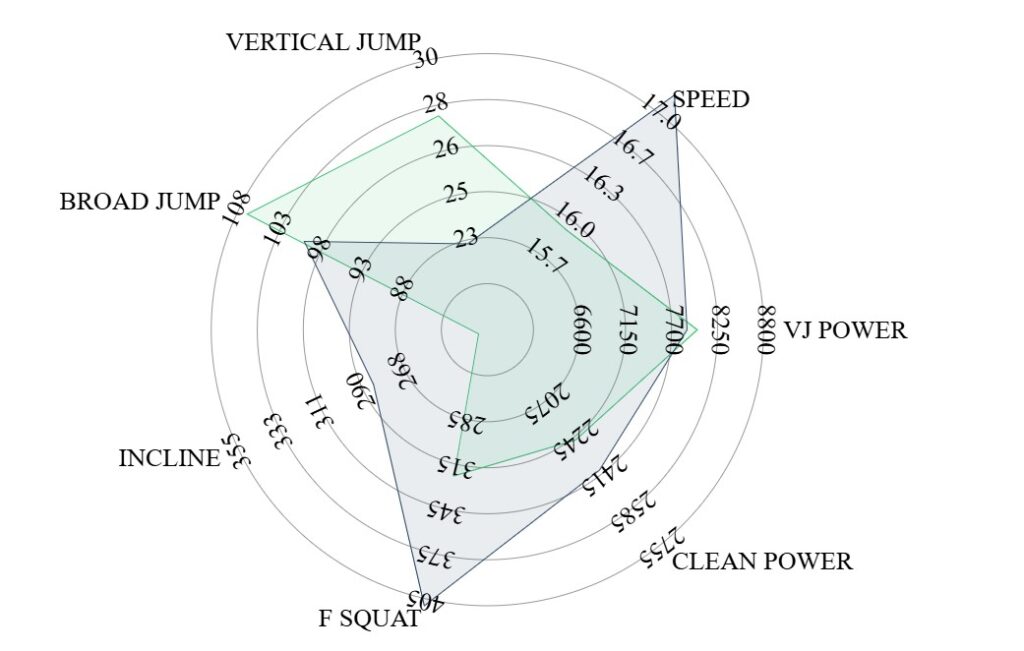
A custom-built radar visual that normalizes performance metrics across different ranges and anchors them to position-specific standards—so the chart actually means something.
Radar charts are powerful in theory, but most implementations fall apart in practice. Performance metrics live on completely different scales—vertical jump might range from 20–50, while peak power sits between 2,500–5,000. Standard radar visuals don’t allow you to control axis minimums and maximums, so the output is misleading at best.
The Radar Visual fixes that.
This product allows you to explicitly define axis minimums and maximums, not just based on absolute values, but based on position-specific standards. What position does the athlete play? What should that position look like? Those standards become the axis.
On top of that, you can layer multiple values—current performance, historical bests, positional benchmarks, or targets—on the same radar, all properly scaled.
This capability does not exist in the Power BI app store. We tested them all. So we built it ourselves.
Features & Advantages
| Feature | Advantages |
|---|---|
| Custom axis scaling | Normalize metrics with completely different value ranges |
| Position-based axis standards | Anchor visuals to what should matter for that position |
| Manual min/max control | Eliminate misleading auto-scaled visuals |
| Multi-layer overlays | Compare current performance, targets, and benchmarks |
| Metric-agnostic design | Use with any performance variable across platforms |
| Clean, interpretable visuals | Make radar charts decision-ready, not decorative |
| Native Power BI integration | Use inside your existing dashboards and workflows |
Why It Matters
A radar chart should clarify performance—not distort it.
When axes aren’t aligned to context, comparisons are meaningless. By grounding every metric to position-specific expectations, the Radar Visual turns complex data into a true performance profile that coaches and athletes can immediately understand.
This makes it possible to answer real questions:
- How does this athlete stack up against positional standards?
- Where are strengths vs gaps?
- Are improvements meaningful or just numerical noise?
Built Because It Didn’t Exist
This isn’t a marketplace add-on or a workaround. It’s a purpose-built visual created because existing tools couldn’t do what performance staffs actually need.
Correct scales.
Correct context.
Real insight.